This is Zoya Daul, the second of three polishes I ordered from the recent Zoya promo. Frankly I'm kind of disappointed. I was hoping Daul would look like it does in this pic:
 |
| Picture is from here: http://killerlipgloss.com/zoya-diva-collection-for-fall-2012-swatches/zoya-daul/ |
But instead it looks like it does in this picture, which is color accurate:
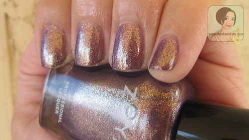 |
| Picture is from here: http://www.theshadesofu.com/2012/07/zoya-nyfw-2012-diva-collection-swatches.html |
The first picture is mine, the other two above are not. Daul is a grape polish with tons of gold glass fleck shimmer. Sounds great on paper, right? Daul looks like a mauve-y bronze in real life. At some angles the grape color is more prominent, but mostly it looks exactly like the picture directly above. This color is not the best on my pale skin. I'm hoping I'll like it better in the summer when I'm "tan". (I'm pale and always wear sunscreen, so it hardly counts as tan.) It is still pretty, just not what I wanted or expected.
EDIT: I tried Daul again in the summer. In direct sunlight Daul looks like the 2nd picture. In fact it looks much better then the second picture. The gold glass fleck shimmer positively glows in the sunlight.
On a whim, I thought I'd try to do a gradient with
Zoya Rica. The colors don't go together, but the finishes do. It was kind of cool, despite the clashing colors. Rica, an orange toned coral with gold glass fleck shimmer, did manage to make Daul actually look purple. I had to brush Rica on for the gradient. When I tried to sponge Rica on with a make-up sponge, all that showed up was the gold shimmers and not the color. I did sponge where the two colors meet to blend them together.
After a while, I had to admit that the colors really didn't go together. I was going to remove it, but instead I tried stamping it with Wet 'n Wild Black Creme and Konad M60. It helped disguise the clashing colors.


.jpg)
No comments:
Post a Comment